
Top Interior Paint Colors for Character Cottages & Modern Toowoomba Homes
Discover the best interior paint color palettes for Toowoomba homes. From warm whites for classic Queenslanders to muted earth tones for modern builds.
Grant Painting Team
15 August 2026
Choosing the right interior paint color is one of the most cost-effective ways to transform your home. However, finding the right shade involves more than picking a swatch off a wall display—it requires matching your paint to Toowoomba’s unique natural light, room orientations, and architectural heritage.
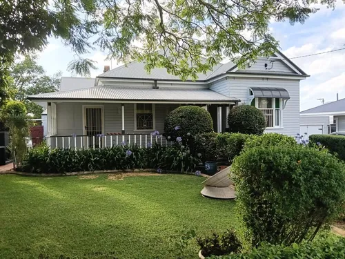
Whether you are restoring a classic East Toowoomba character cottage with VJ walls and high ceilings or styling a sleek new build in Middle Ridge, your wall color sets the backdrop for your everyday life.
This guide explores the top interior paint palettes trending across Toowoomba homes, along with practical tips on sheen selection, lighting, and washability.
1. Timeless Warm Whites: Perfect for Character Homes & Heritage VJ Walls
Pure bright whites can often feel clinical or cold, especially in older homes with vast room dimensions. Warm whites incorporate subtle yellow, beige, or pink undertones that catch natural sunlight and produce a cozy, inviting atmosphere.
- Best Suited For: Traditional Queenslanders, Colonial cottages, and homes with native timber floors or ornate ceiling roses.
- Why It Works: Soft whites soften stark shadows on vertical joint (VJ) timber boards and elevate decorative architraves without distracting from historic details.
- Top Design Pairing: Pair warm white walls with crisp quarter-strength white trims on doors and window frames for subtle, elegant contrast.
2. Muted Earth Tones: Bringing the Garden City Indoors
Toowoomba is known as the Garden City, and bringing natural, organic tones indoors creates a seamless transition between your interior living areas and exterior gardens.
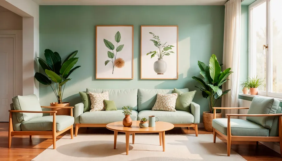
- Sage & Eucalyptus Greens: Soft, muted greens bring a sense of calm to bedrooms and home offices. They reflect outdoor foliage and ground light-filled spaces.
- Warm Greiges & Sandy Beiges: Greige (a blend of grey and beige) offers the modern feel of grey with the comforting warmth of beige. It adapts seamlessly as natural sunlight shifts throughout the day.
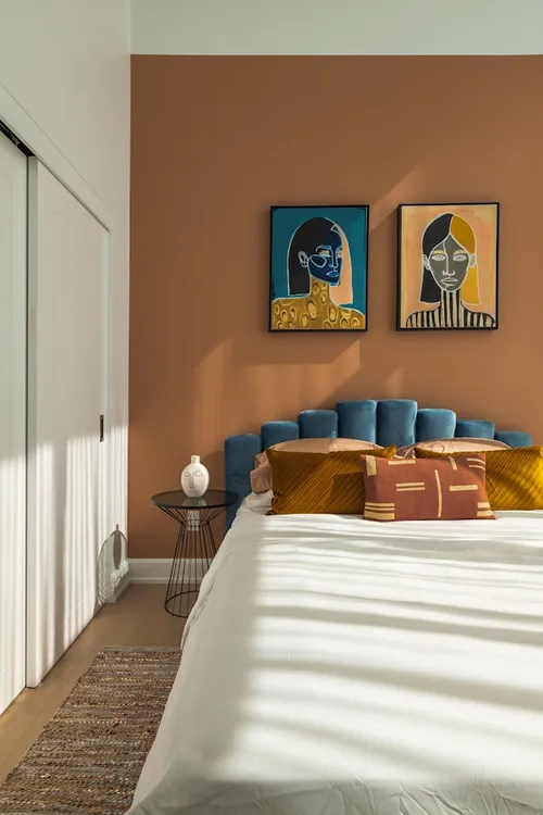
- Terracotta & Warm Clay Accents: Subtle clay tones add depth to dining nooks or entry hallways, pairing beautifully with natural linen, stone, and indoor greenery.
3. Bold Feature & Accent Walls: Adding Architectural Depth
If you love dark, moody tones but worry about making a room feel small, feature walls are an ideal solution. A strategically placed dark accent wall pulls the eye inward and creates a clear focal point.
- Deep Charcoal & Slate: Excellent behind living room television units or fireplace mantels to reduce visual clutter and create a cozy evening vibe.
- Navy & Midnight Blue: A popular choice for bedhead walls in master suites, adding depth and a feeling of luxury.
- Forest & Olive Green: Adds rich warmth to modern study areas or formal dining spaces.
Matching Paint Sheens to Room Functions
Choosing the correct paint finish is just as crucial as selecting the color. Different sheens handle light, wear, and cleaning differently:
| Paint Finish | Best Used For | Key Benefits |
|---|---|---|
| Flat / Matte | Ceilings & low-traffic formal spaces | Conceals surface bumps, plaster joints, and wall imperfections. |
| Low-Sheen | Bedrooms, living rooms, hallways | Excellent balance—easy to wipe clean while hiding minor wall blemishes. |
| Semi-Gloss | Doors, trims, architraves, skirtings | Highly durable, moisture-resistant, and simple to clean. |
| Gloss / Satin | Kitchen & bathroom cabinetry, trims | Provides maximum water resistance and a sleek, modern finish. |
3 Essential Tips Before Painting Your Toowoomba Home
- Test Swatches in Multiple Lights: Paint a large sample board (not directly on the wall) and move it around the room. Check how the color looks at 8:00 AM, midday, and under warm artificial lighting at night.
- Account for Window Orientation: South-facing rooms receive cooler, blue-toned natural light, making cool greys look cold. Warm undertones offset this effect nicely.
- Prioritize Premium Washable Paints: For family homes with kids or pets, insist on premium low-sheen acrylics that allow you to wipe away scuffs and fingerprints without leaving shiny spots.
Transform Your Home with Professional Interior Painters
Ready to refresh your living spaces with a professional interior finish? Our experienced team at Grant Painting Toowoomba handles every detail—from surface prep and gap filling to clean, crisp lines on skirts and architraves.
Contact Grant Painting Today for a Free Interior Consultation or call our team to discuss your color ideas.
Need professional help with this project?
Our licensed Toowoomba painting team handles all prep work, painting, and cleanup.
Written by
Grant Painting Team
Local Toowoomba painting specialists with expertise in weather protection, interior refreshes, and timber decking restoration.